Posts

Showing posts from July, 2012

Tracking the recovery (2) - Europe

Image
The series of tracking the recovery continues  with Europe; in particular looking at the manifestation of the recovery in the Eurozone and the UK. The analysis will constrain itself only on observing the leading indicators from the OECD database and the Conference Board , and compare these to their levels from 6 months ago .  We start with the Eurozone leading indicator (LEI) published by the Conference Board. They compare the LEI with a coincident economic index and the quarterly RGDP growth rate. The latest version of the indicator was published last Friday, 27th July 2012 (data for end of June). In the previous post, from 6 months ago I explain why in Europe we only focus on the final product, the LEI index, instead of going through every individual indicator as we did in the US tracking . (Click on image to enlarge) Source: The Conference Board, Global indicators, Euro Area After the initial recovery in the first quarter of 2012, shown in the LEI (blue line) as a sma

Tracking the recovery (2) - USA

Image
Business cycle tracking continues with a half-year update but this time under a new title: 'Recovery tracking'. In the first version, published back in February (the latest data for January or December), the recovery didn’t look too good, but there were signs that things could have been better. After seeing confidence being lifted in February and March, things went back to their gloomy reality in May and June.  Back then, I also presented an overview of business cycle indicators and valuable sources useful to familiarizing oneself with the business cycle theory. I advise the current readers to take a look, simply to get a better idea of the difference between leading, coincident and lagging indicators, and why and where economists use them.  The indicators I observe here aren’t necessarily the best ones, but they do have a certain reputation for precision and robustness.  As was the case last time, I start with the United States (for which there is a wide range of

Britain’s productivity conundrum

Image
Note: This article was written for the Adam Smith Institute blog and was published there earlier today. It came as a timely response to today's press release from the Office for National Statistics (ONS) on UK's third consecutive negative growth ( -0.7% this time ). They seem to blame it on an extra bank holiday due to the Diamond Jubilee (!?). I already covered that fallacy back in May . For all my other ASI writings see here .  Also, I had another article published this week, at the IEA blog , which was a combination of my two previous posts on Germany and Sweden . For all my IEA writings see here . UK unemployment is falling, employment is rising , hours worked are increasing, while output is still stagnant . What does all this mean? How can the private sector create more jobs, while the total output it produces is still stagnating or even decreasing? Some economists seem puzzled by this saying that one set of data in this case is wrong . Even though this might b

The LIBOR scandal

Image
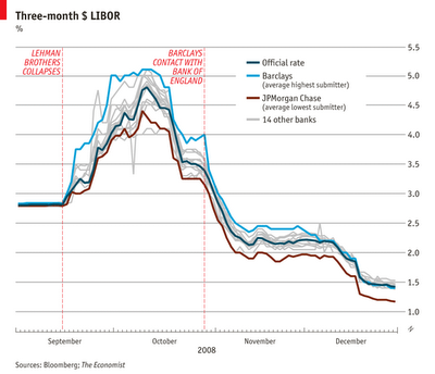
London’s financial markets have been disrupted severely in the past few weeks. The LIBOR scandal revealed a striking image of how the financial system worked and how it was interrelated with the political and the regulatory environment. The signals were being disrupted from a whole number of sources.  The LIBOR is the London Inter-Bank Offered Rate, which basically means the rate at which banks are willing to lend money to each other. It is a benchmark rate used for a number of transactions and financial instruments, ranging from mortgages to derivatives, thereby affecting the prices of loans. Its total breach on the market is an estimated $800 trillion-worth of financial instruments. The whole process of setting up the LIBOR rate is that each bank sends its own estimate of the rate to the British Bankers’ Association (BBA), an independent body which then creates the benchmark weighted rate by cutting off the top and bottom 25% of the individual submissions. It operates on an au

Graph of the week: Innovation Index

Image
This month the collaboration between INSEAD , a well respected business school, and the World Intellectual Property Organisation ( WIPO ) has released a fifth edition (first co-published, usually it was published solely by the INSEAD) of the GlobalInnovation Index (GII), a measure of innovation and technological progress in an economy. Download the full report here . "The GII recognizes the key role of innovation as a driver of economic growth and prosperity and acknowledges the need for a broad horizontal vision of innovation that is applicable to both developed and emerging economies, with the inclusion of indicators that go beyond the traditional measures of innovation (such as the level of research and development in a given country). ... [It]relies on two sub-indices, the Innovation Input Sub-Index and the Innovation Output Sub-Index, each built around pillars. Five input pillars capture elements of the national economy that enable innovative activities: (1) Institutions

Book reviews

Image
Two of my book reviews got published recently. They are both on inspiring books I recommend to my readers, at least as a good summer reading.  The most recent was on Acemoglu and Robinson's newest and most formidable book yet, "Why Nations Fail: The Origins of Power, Prosperity, and Poverty" published by the Adam Smith Institute (I mentioned some interesting findings of the book in a few previous blog posts, see here and here , or see the lecture ).  Here's an excerpt from the review to get the general idea: "Acemoglu and Robinson formulate their central hypothesis around the fact that a strong set of economic institutions which will guide incentives towards creating wealth can only be achieved through more political freedom. Political inclusiveness and the distribution of political power within a society are the key elements that will determine the success or the failure of nations."   "...The problem isn’t that poor nations remain poor

Voting with feet (part 2)

or Could the Tiebout model be used to solve problems in health insurance? After the first part introduced the ‘voting with feet’ concept and touched upon migration patterns in the US to see whether this story actually holds, the second part will ask whether the voting with feet concept can be applied to the problem of US health care provision.  The individual mandate and the health insurance debate was one of the key points that will characterize Obama’s presidency. While arguments in favour suggest the individual mandate is necessary to address the adverse selection problem in the health insurance market (a classical paternalist approach), arguments against usually touch upon individual liberty issues of forcing upon the people to purchase insurance when they choose not to. There is also an interesting argument from Cochrane that the supposed market failure in the health insurance market exists due to over-regulation of that market (or in other words due to government failur

‘Voting with feet’ (part 1)

Image
Tiebout model Charles Tiebout first proposed the idea of "voting with feet" in his 1956 seminal paper “ A Pure Theory of Local Expenditures ” published in The Journal of Political Econom y, as a non-political, market way to solve the free rider problem in local governance.  The idea is simple. The model basically implies that people will choose where they want to live based on local public goods and services offered in different municipalities. People differ in their individual preferences towards different services and their willingness to pay for these services. They will choose where to live accordingly. A local provision of public goods will hence depend mostly on the taste of its residents – a logical proposition.  The idea was even embraced by two of my favourite Nobel Prize laureates Friedman and Hayek :  Friedman: "...The second broad principle is that government power must be dispersed. If government is to exercise power, better in the county than

Dr Arthur Laffer at the IEA

Last week I had a chance to see the Arthur Laffer lecture at the Institute of Economic Affairs in London, and I have to admit it was one of the best lectures I've been to while in London (these include Nobel prize laureates Christopher Pissarides and  Elinor Ostrom , Olivier Blanchard , Niall Ferguson , Jesús Huerta de Soto , John Allison , Tom Palmer ,  Detlev Schlichter ,  Daniel Klein,  Adair Turner, Martin Wolf, John Cochrane, Madsen Pirie, Tim Evans and many other great professors, economists, philosophers and politicians).   So in a great comp etition this lecture strikes me as one of the very best. Dr Laffer underlined his theory of the conveniently called  Laffer curve  while going through  the history of US taxation from 1917, judging all the administrations and all the effects their decisions had on tax revenues. His biggest praise went to the Reagan and Clinton administrations (not surprisingly, the ones where he served as an adviser to). He also coupled the lecture

More 'good hunches'

Image
In previous texts, I've pointed out to some more and some less precise predictions on future economic events. While Samuelson was way off on the Soviet Union's economic expansion (as are so many economists today on China ), Mankiw was pretty accurate regarding the problems of the US debts and budget deficits along with the unsustainability of the US social security model and subsidized mortgages ( this was the topic of the original 'Good hunches' post ). Other good hunches include Rajan , Roubini  (aka Dr. Doom),  Shiller  (Mr. Bubble) and a few  others  on the upcoming financial turmoil. However, good predictions are usually very hard to find. In fact the economic science is faced with much more bad predictions. Not to go too deep in history and examine the predictions on the demise of the Soviet Union and communism in general, just remember how many pundits claimed in November 2011 that the Eurozone will break up by the new year? And yet it still stands, not o

Inequality and the crisis: problems of reversed causality

There is a growing number of recent articles that attempt to link inequality as one of the causes of the US financial crisis in 2007 , and even to the European contagion that followed afterwards (see here , here  or  here , and there's even a documentary about it). It all started with an argument from prof. Rajan in his excellent and highly recommended book Faulty Lines . The argument goes something like this:  Lower and middle-income consumers in the US experienced stagnating real incomes over the last 30 years (see here ), so their response was to reduce savings and increase borrowing therefore pilling up more debt. That meant that private consumption, and hence aggregate demand and employment, were kept high, creating momentum for the credit bubble.  In addition Rajan claims that misguided government policies on the housing market contributed to the expansion of credit to households:  “He exposes a system where America's growing inequality and thin social safety net